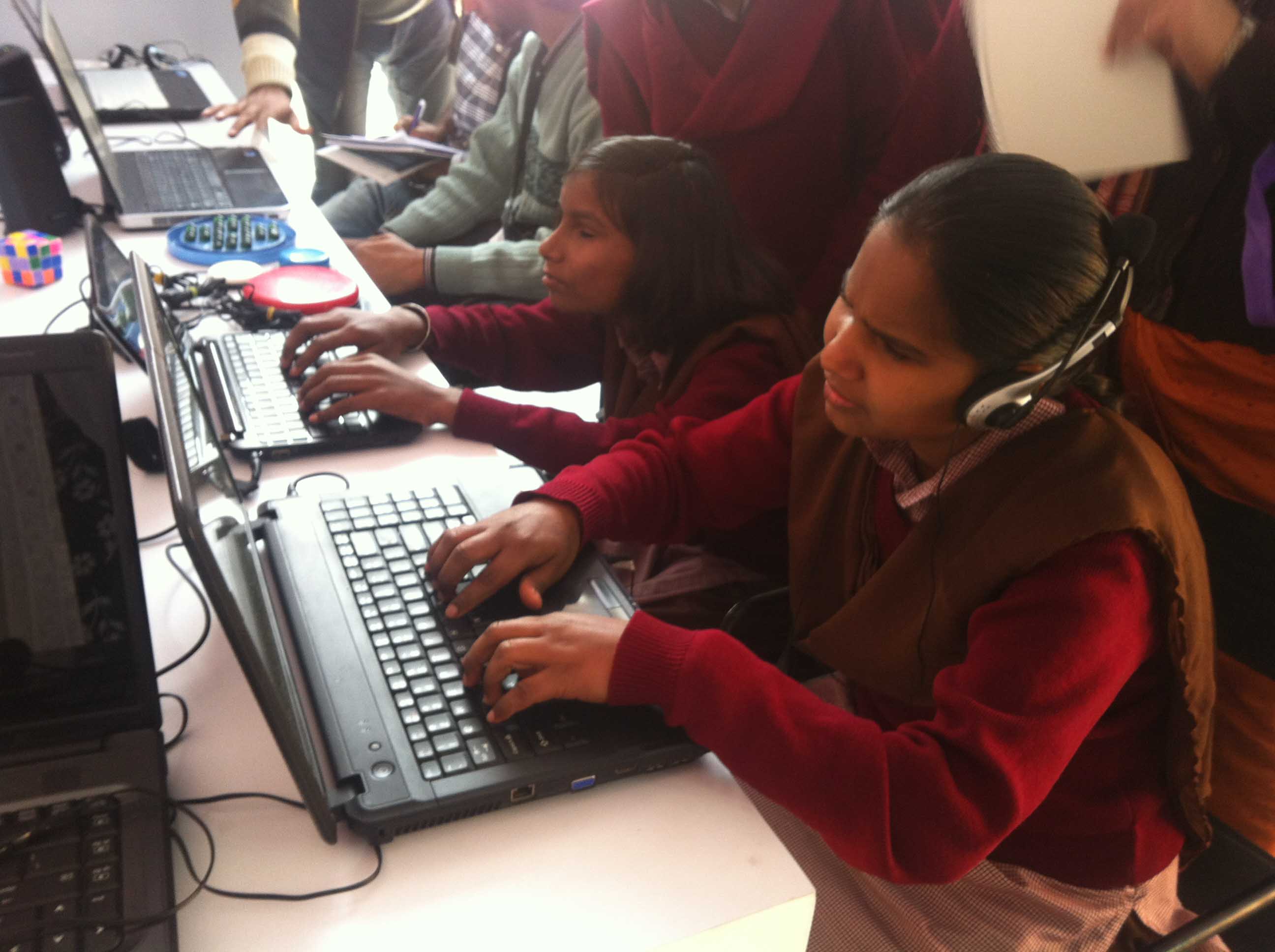
In honor of GAAD (Global Accessibility Awareness Day), I interviewed a developer who is active in the accessibility community to gain some insights on the importance of web accessibility.
Applying for jobs, registering your vehicle, selecting classes for the next school semester, and other tasks can become close to impossible if you have no access to the internet. Imagine for a second that you had no access to Google, Netflix, and dank memes. This sucks. Now let's imagine you couldn't use your computer's mouse or trackpad. How would you navigate the page or click on an image? Life would suck, royally. This is the reality for a population of internet users.
What is accessibility?
Accessibility refers to the design of products, devices, services, or environments for people who experience disabilities. Usability affects from the blind and color blind to the deaf and seizure prone. People in developing countries use the internet but may not necessarily know English. A site with poor usability makes it challenging for the elderly and those with motor skills disabilities to use.

Federal websites must adhere to Section 508 which is a law that states Government sites must be accessible for people with disabilities. Some sites follow the ADA (Americans with Disabilities Act) guidelines loosely but the majority of websites could make a concerted effort to improve.
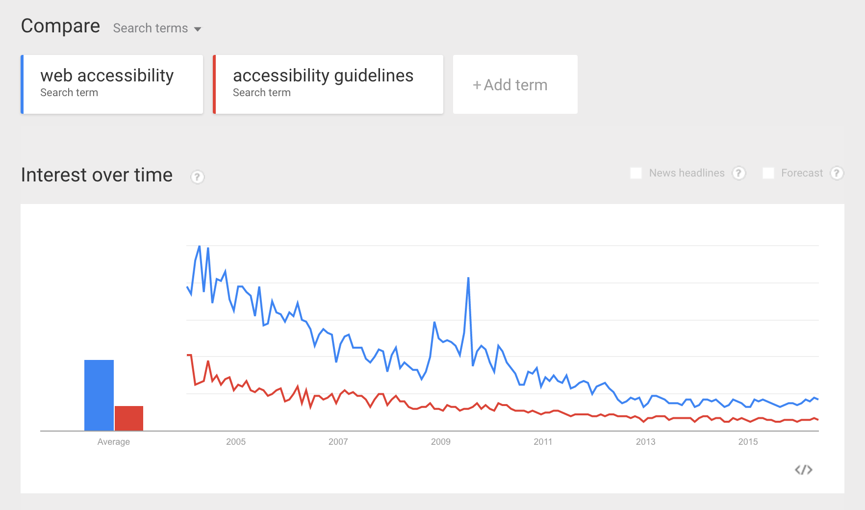
The dialogue is just not there.
And it's unfortunate. You'd think that with the current tech boom more developers and startups would pay attention to accessibility. The fact of the matter is, unless you have a disability or are directly affected by a family member with one, chances are you've never given it much thought. Even I didn't learn about web accessibility while I was studying web development.

Despite the lack of awareness, this leaves room for opportunity. Accessibility applications can be expensive and have a steep learning curve. There is an untapped market with both native and web accessibility applications that have capacity for great improvement. The value you contribute through innovation and open source software is limitless.
Why does making my site accessible matter?
The UN Convention on the Rights of Persons with Disabilities recognizes access to information and communications technologies, including the Web, as a basic human right.
The internet has become more than humanity's encyclopedia. Cultural and social behaviors bubble out of the world wide web and become elements of today's society. The internet provides a medium for people with disabilities to interact. Everyone benefits when we support social inclusion for all. Tech is integrated in our culture and everyday life. Let’s try an experiment. For the next 30 seconds, navigate any webpage you want (this article can wait), and try navigating without a mouse. Hit tab and enter. See what it’s like to click links, fill in a form, whatever you like. Or better yet, if you have 3 or 4 minutes, turn on VoiceOver, and navigate with just the audio. Use a screen reader with voice recognition if you're feeling lucky.
By just taking those few seconds or couple of minutes, you can empathize with an entire world of users whose experience on the web is completely different from our own. And in the end, isn’t creating great experiences what software development is all about? This insight not only makes you a better developer but paves the way for building better UX. Beautifully designed sites avoid unnecessary noise and are navigable. Elegant applications incorporate architecture that flows and actions that are clear. Together we can make web accessible by default, the standard.
Alright, how do I start making my site accessible?
It's easier if you start putting thought into the site structure and picking colors from day one. Consider the flow of the site, would you be able to navigate through it if you were drunk? Test your colors with a contrast checker and start adding links to skip repetitive content. Imagine a screen reader describing the Facebook navigation every time you load the page. After the fifth time, you'd know the messages icon goes right after the friend requests.
Make sure you’re being semantic with your HTML tags. Use an actual <button> element and divert from doing this:
<div class="button" {{action"showModal"}}>Open Modal</div>
If you are in the practice of using <div> be cautious because the DOM doesn't recognize hierarchy. Divs and <span> should be used for styling, else a screen reader won't recognize a header and won't read it. If you must use a div as a button, please us the role attribute. This is a last resort.
WCAG 2.0 principle: Perceivable, Operable, Understandable or Robust
Never use a timeout because the user won't be able to get to the content in time and it turns into a videogame that you must master to get to the next page. Make use of checkboxes or radio buttons. Add labels for your forms and tables. An added benefit from making your site accessible is that it overlaps with other best practices such as mobile web design, search engine optimization (SEO), and usability.
Here are couple tools you can start playing with:
- aXe is chrome extension that provides quick accessibility testing.
- AChecker is available if you're not a fan of chrome extensions. Note: If you have a single page app it won't work.
- ContrastChecker- does just that.
- WAVE (Web Accessibility Evaluation Tool) also offers a Chrome extension.
- AATT, Automated Accessibility Testing Tool helps you integrate accessibility testing into your existing automation test suite.
If you're seeking a wiki style run through of best practices, I highly recommend W3C (Web Accessibility Initiative), they have compiled strategies, guidelines, and resources on accessibility. Stanford University has generated SOAP (Stanford Online Accessibility Program) to provide resources for designers, developers and content creators. Hopefully these resources will make it easier to transition to building sites that are sophisticated, accessibility friendly and most importantly inclusive.
You tha real MVP
I'd like to thank Robert DeLuca for taking the time from his schedule to allow me to interview him on accessibility. Rob is a Frontend developer and a contributor to ember-a11y, an open source initiative to create Ember addons that help make accessibility default. He's also created awesome applications like DropKick, a plugin for creating beautiful, accessible, and painless custom dropdowns. You can find him on the Twitterverse (@robdel12) or talk accessibility on the Ember Slack (@robdel12).
I’m Stephanie Riera (@stefriera), and I build web applications for a living at The Frontside. If you enjoyed this, I'd love to hear from you! Shoot me a line at stephanie@frontside(dot)io.
